+32 460 23 96 44

On this page
- Why a Logo Matters for Your Jewelry Website
- Examples of Jewelry Business Logos That Work Well
- Key factors that make a logo work effectively
- Mistakes to Avoid in Jewelry Logo Design
- Testing Your Logo for Impact
- Where to Use Your Logo
- When & How to Rebrand Your Jewelry Logo
- Can AI Really Make the Logo You Desire?
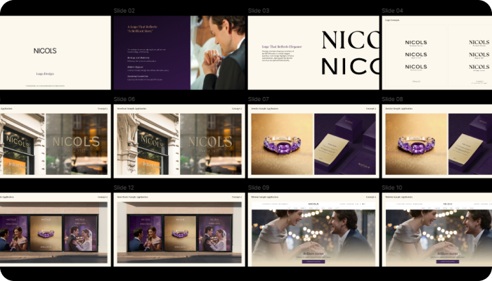
Your logo is more than just a decorative symbol—it's the face of your brand. Whether you're starting a handmade jewelry business or launching a luxury diamond line, a thoughtfully designed logo sets the tone for your identity, builds trust, and helps customers recognize your products in a sea of competition.
In this guide, we’ll walk you through the complete process of designing a jewelry logo that’s not only beautiful but deeply aligned with who you are as a brand.
Why a Logo Matters for Your Jewelry Website
Brand Identity Basics
Your logo communicates who you are—visually and emotionally. For jewelry brands, which often deal in emotion-driven purchases (think engagements, anniversaries, milestones), your logo plays a massive role in customer perception.
It builds instant recognition.
It sets the emotional tone for your offerings.
It supports brand storytelling across platforms.
First Impressions & Trust
According to research, people form an opinion about a brand within 0.05 seconds. That’s faster than a blink. A professional, clean, and distinctive logo ensures you're making a great first impression, especially when you're selling something as personal and valuable as jewelry.
Examples of Jewelry Business Logos That Work Well
Let’s look at a few jewelry brands and how their logos help them stand out. These examples show how a well-designed logo can support a brand’s image and work across different uses.
Pandora
Pandora’s logo uses a clean and readable font. It often includes a small crown over the “O,” adding a subtle design touch. The simplicity makes it easy to use on packaging, jewelry tags, websites, and more. It also matches the brand’s elegant and personal style of jewelry.
Tiffany & Co.
Tiffany & Co. is known for its classic logo and signature Tiffany Blue color. The font is traditional and refined, which fits the brand’s luxury image. The blue shade, chosen by founder Charles Lewis Tiffany, has become strongly linked with the brand. This logo is versatile—it looks just as good on a small gift box as it does on a store sign or website.
Swarovski
Swarovski’s logo combines a modern font with its signature swan icon. The design is clean but also distinctive, representing the brand’s focus on crystal and elegance. It works well in both digital and print formats and is easily recognized in different settings, from jewelry boxes to online ads.
Key factors that make a logo work effectively
1. Simplicity Wins
A simple logo is easier to recognize and remember. It works well across different platforms—whether on a website, a business card, or a billboard.
Example: Nike
Nike’s logo, the “Swoosh,” is one of the simplest logos out there. It doesn’t rely on text or color to stand out. Its simplicity makes it instantly recognizable and flexible for all branding purposes.
Example: Apple
Apple's logo is just an apple with a bite taken out of it. There are no extra elements. Its simplicity helps it remain consistent across packaging, stores, and devices.
2. Timeless Design
Trendy logos may work for the short term, but timeless logos continue to be relevant for decades.
Example: Coca-Cola
Coca-Cola’s script logo has barely changed in over a hundred years. The classic font style has become a key part of the brand’s identity, making it instantly recognizable worldwide.
Example: IBM
IBM’s striped logo hasn’t changed much since the 1970s. The horizontal stripes give it a distinctive look that still feels modern while preserving its long-standing legacy.
3. Memorability
Memorability means that a person can remember and recall the logo after seeing it just once or twice.
Example: McDonald’s
The golden arches “M” logo is simple, bold, and bright. You don’t need to see the word “McDonald’s” to know what the brand is. It’s an image most people around the world can recall easily.
Example: Twitter
The bird logo became symbolic of the platform. Even without text, the bird represents tweets and quick communication, which aligns with the brand's purpose.
4. Versatility
Good logos look good everywhere—whether in black and white, in small sizes, or on different backgrounds.
Example: Adidas
Adidas has used variations of its three-stripe logo for years. The logo works well on shoes, clothes, packaging, and online. Its versatile design supports different product lines while staying consistent with the brand image.
Example: Mastercard
Mastercard’s overlapping red and yellow circles can appear on digital payments, cards, or merchant signs. Even when the brand name is removed, the logo is still effective.
5. Meaningful Design
Logos that have hidden meanings or symbols behind them can connect more deeply with customers.
Example: Amazon
The Amazon logo has an arrow from A to Z, showing they sell everything from A to Z. The arrow also looks like a smile, giving the brand a friendly tone.
Example: FedEx
There’s a hidden arrow between the “E” and the “x” in the FedEx logo, symbolizing speed and direction—two things critical to a delivery service.
6. Strong Use of Color
Colors have psychological effects and can help convey a brand’s message without words.
Example: Google
Google uses bright, primary colors with one secondary color (green) to show playfulness and a break from the expected. The color pattern helps the brand feel friendly and non-threatening.
Example: Pepsi
Pepsi’s red, white, and blue design creates an association with its American heritage. The colors also help distinguish it clearly from Coca-Cola.
7. Consistency with Brand Message
A logo should reflect the tone and purpose of the business.
Example: Mercedes-Benz
The three-pointed star represents dominance on land, sea, and air, showing the brand’s commitment to engineering and performance.
Example: WWF (World Wildlife Fund)
The panda logo is soft, friendly, and easy to reproduce. It also emphasizes the conservation of endangered species, directly supporting WWF’s mission.
Mistakes to Avoid in Jewelry Logo Design
Designing a jewelry logo requires careful thought. Here are some common mistakes to watch out for:
1. Adding Too Many Details
A logo should be simple and easy to recognize. Avoid intricate designs that might not be clear when resized. Clean, minimal logos work better across different formats.
2. Chasing Design Trends
Trendy elements may look good today but can feel outdated quickly. Focus on creating a timeless logo that reflects your brand’s long-term identity.
3. Choosing Hard-to-Read Fonts
Fancy script fonts can be elegant, but when overused, they reduce readability—especially in small sizes. Choose fonts that are clear and reflect your brand style.
4. Ignoring Scalability
Your logo should look good whether it's on a website favicon or a large banner. Test it in various sizes to ensure it stays recognizable.
Testing Your Logo for Impact
1. Test in Different Sizes
A strong logo should be flexible enough to work in both small and large formats. For example:
Small size: Think of a website favicon (the tiny icon in the browser tab) or an Instagram profile picture. In these spaces, your logo needs to stay clear and recognizable even when it’s very small.
Large size: If you ever use your logo on a banner, shop board, or display stand, it should scale up without losing its quality or balance.
What to do:
Print or display your logo at different sizes to see how it looks. You may need a simplified version for small spaces and a full version for larger use.
2. Ask for Feedback
Sometimes, it’s hard to view your own design objectively. Getting feedback from others—especially people who fit your ideal customer profile—can give you fresh insights.
Who to ask:
Friends or family who fit your target audience
Loyal customers, if you already have them
A small group of followers on social media
What to look for:
Is the logo easy to understand?
Does it give the right impression of your brand?
Is there anything confusing or hard to read?
Collecting honest opinions early on can help you make better choices before you go live.
3. Run A/B Tests
If you’re torn between two versions of your logo, A/B testing can help you choose based on real user behavior.
How it works:
Create two versions of a webpage or ad, each with a different logo
Show each version to a portion of your audience
Track which version performs better in terms of clicks, time on page, or other goals
Why it helps:
Rather than guessing, you’re using data to see which logo connects better with your audience.
4. Check in Black and White
In some cases—like printing invoices, using stamps, or embossing—your logo may appear without color. It’s important that your design still works in black and white.
What to test:
Remove the color and look at your logo in grayscale
Make sure all elements are still clear and distinguishable
Avoid designs that rely too heavily on color to communicate meaning
This check ensures your logo remains functional and consistent across all formats, including non-digital uses.
Where to Use Your Logo
Your logo will show up in multiple places. Here’s a simple guide to where and how it can be used:
Each of these placements may require a slightly different version of your logo, such as simplified or resized versions, so keep that in mind when designing.
How to Get Feedback on Your Logo
Feedback can help you refine your logo before launching it. Here are a few ways to gather it:
Design Communities: Share your logo on platforms like Behance or Dribbble to hear from other designers.
Audience Polls: Use surveys or polls to get feedback from potential customers.
Social Media Testing: Use Instagram stories or posts to show different logo options and ask followers which one they prefer
When & How to Rebrand Your Jewelry Logo
A rebrand doesn’t have to be drastic, but there are times when it makes sense.
When to Consider Rebranding:
Your target audience has changed over time
Your current logo no longer fits your style or values
You’re introducing new products or expanding your business
Steps to Rebrand:
Review Your Current Brand
Understand what’s working and what’s not with your current logo and brand style.Clarify Your New Direction
Decide what message or feeling your new logo should communicate.Design for the Future
Make sure the new logo is flexible and works across all platforms and uses.Announce the Change
Introduce your updated logo through your website, social media, and packaging. Keep the messaging simple and consistent.
Can AI Really Make the Logo You Desire?
AI tools can definitely help you generate logo ideas quickly, offering a wide range of styles, icons, and fonts. They're fast, affordable, and great for basic inspiration. But when it comes to truly capturing the soul of your jewelry brand, there’s still nothing like the human touch. A designer understands emotion, backstory, and brand nuance—something AI just can’t replicate with the same depth. While AI can offer templates, it can’t interpret your vision the way a creative professional can. For something as personal and emotional as jewelry, human creativity still leads the way.
Conclusion: Create a Logo That Shines with You
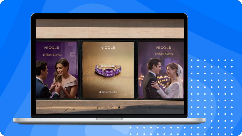
Designing a jewelry website logo that represents you is about more than aesthetics. It's about telling your story, connecting with your audience, and standing out in a visually competitive space.
Need help bringing your jewelry logo to life? Consult with professional designers from Jewelexperts.com to get the sparkle just right.
Design a Memorable Jewelry Logo to Enhance Your Brand Identity.
A well-designed logo can help your jewelry brand look more authentic and professional. At JewelExperts.com, we specialize in designing logos that reflect your brand’s style and help you stand out—both online and in-store.
Whether you’re just starting out or looking to refresh your current logo, our team of experienced designers is here to help.
Why choose JewelExperts.com?
We understand the jewelry industry
We create logos that look good everywhere—website, social media, packaging, and more
Our designs are clean, scalable, and timeless
Ready to get started?
Reach out to JewelExperts.com and let us help you bring your jewelry logo to life. Our designers will work with you to make sure it shines just right.