+32 460 23 96 44

On this page
- Problem 1: Slow Loading Pages because of High-Resolution Images
- Problem 2: Confusing Navigation
- Problem 3: Bad Website Design on Mobile
- Problem 4: Boring/ Generic Product Descriptions
- The Art of Storytelling to sell jewellery
- Problem 5: No Clear CTAs (Call to Actions)
- Why Clear Calls to Action are Crucial
- The Solutions:
- Additional Problems to Consider
- Conclusion
Introduction
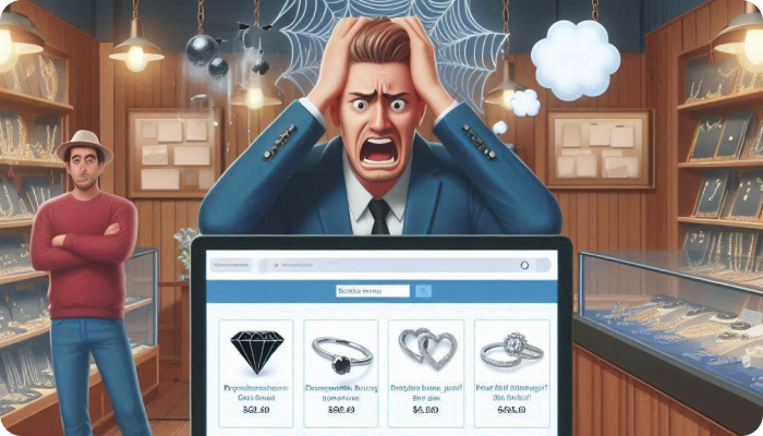
We have noticed nowadays, even the most experienced jewelers have websites that could make selling the most exquisite piece of jewellery way harder than it should be!
According to some surveys, the jewellery industry has one of the lowest online conversion rates, hovering around a mere 1.26%? We know high prices play a role, but sometimes the problem is your website – particularly your website design.
In this blog, we're going to point out some common website mistakes that scare off potential customers.
But don't worry! For every problem, we'll have a simple, easy-to-implement solution to turn your website into a diamond-selling machine.
We’ve compiled the problems and their best solutions just for you, so continue reading to increase the revenue and traffic on your website🚀!
Problem 1: Slow Loading Pages because of High-Resolution Images
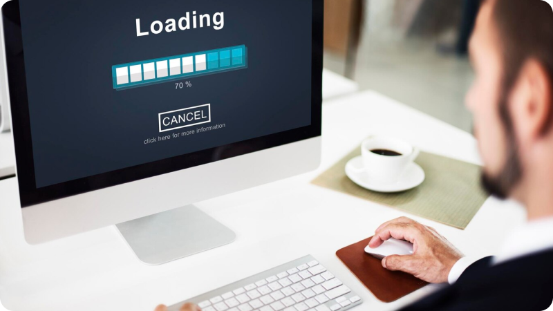
Why are high-resolution images a problem
We all want the jewellery photos on websites along with their beautiful details to be crystal clear!
But sometimes, because of the huge file size of the images the website becomes slow!
What if someone clicks on your rings, ready to be wowed... and... they're waiting. And waiting⏳. That spinning circle is basically mocking them. Chances are, they aren’t going to stick around.
Why Speed Matters :
We live in the "I want it yesterday" world, especially online. Slow websites just feel...well, kinda sketchy. It makes a store look like it hasn't been updated since the dinosaur era🦕!
Plus, here's the harsh truth(along with proof of course)...
Did you know that a site that loads in 1 second has a conversion rate 3x higher than a site that loads in 5 seconds? (Don't worry, we got that info from a reliable source!)
Solutions:
👉 Image Optimization: Websites like TinyPNG are your friend! They'll resize photos without making them look blurry.
👉 Lazy Loading: Lazy loading is a trick where the website only shows pictures as you scroll down. Faster loading, happy customers!
👉 CDNs: Okay, CDNs (Content Delivery Networks) might sound fancy, but they're basically like having a bunch of speedy delivery guys for your site. This helps people around the globe see your jewellery in milliseconds.
Problem 2: Confusing Navigation
So there’s this super excited customer who lands on your website, ready to find their dream diamond piece. But your navigation is a tangled mess! Too many menus, and weird categories, and they're lost. And there goes a potential sale! Confusing Navigations is one of the biggest website mistakes that businesses make.
Why is Confusing Navigations a Bad News
When a website is hard to navigate, people get frustrated. Frustrated people don't turn into happy customers! They might bounce off your site before ever seeing your most gorgeous designs. Not just that, it’s possible that they never come back and even tell their family/friends about their experience on your website.
The Fact(this time, a good one)
Did you know fixing your website navigation can BOOST your sales miraculously? Studies show Well-designed sites have page abandonment rates up to 41% lower than their inferior cousins.❗
Now you may ask what can be the probable solutions,
Here you go!
Keep Your Menus Simple: Think of the basics: "Rings," "Earrings, "necklaces." If you need to break it down further, make sure the subcategories are obvious (like "Engagement Rings" or "Diamond Studs"). No one wants to play a guessing game to figure out where they are going to find their desired product!
Search Bar to the Rescue: Make your search bar big and obvious! This is for customers who know exactly what they want ("rose gold pendant" for example). Think of it like a shortcut to their “WANTED” piece. You should optimize your search bar in such a way that similar products should also come up when the search button is hit. This way, the probable customer would know what other options are there at your Web Shop.
Leave a Breadcrumb Trail: These little markers at the top of a page show customers their path ("Home > Jewellery > Rings"). It helps them find their way back if they lose track of where they started, and that means they're less likely to give up.
Adding “Sort” and “Filter” features: For customers who are on a budget, the “Sort” feature could be really helpful as they would be able to see the cheaper alternatives at first. This will make their decision fast and easy. The “Filter” feature can be added for people looking for a particular design, size, color, etc.
Example: Let's say a customer is looking for a special anniversary gift💍. If your menu is clear, they can easily find "rings," and then maybe "anniversary bands" as a subcategory. Add a fast search function, and BOOM– they've found the perfect ring for their love in no time.
Problem 3: Bad Website Design on Mobile
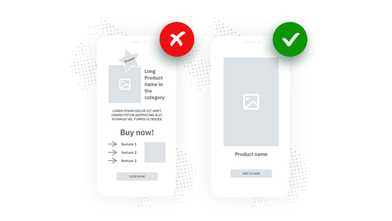
Okay, be honest…have you ever tried to shop for jewelry on your phone? If your website isn't designed with mobile in mind, it's a frustrating experience and a foolproof plan for losing those precious sales!
Tiny text, impossible-to-tap buttons, images that don't fit the screen – it's enough to make anyone give up and go elsewhere.
Why Is Mobile Website Design a HUGE Deal
Most jewelry shopping now happens on mobile devices! People are scrolling on their phones during commutes, on lunch breaks, even while relaxing on the sofa. If your website looks cramped, blurry, or just plain weird on a phone, guess what?
They're going to find a competitor whose site looks as good as their jewelry!
The Fact
Mobile e-commerce is booming and not showing any signs of slowing down! Experts predict by 2027 there will be $3.4 trillion of mobile e-commerce sales, in stark contrast with the $982 billion that were generated in the segment as recently as 2018. That means if your site isn't mobile-friendly, you're essentially turning away most of your potential customer
But it's Fixable⚒️!
The Solutions:
Here's the good news: making your website shine on all devices isn't as complicated as you might think. Let's get into the solutions, and soon you'll be billing those smartphone shoppers:
👉 Responsive Design: This means your website adapts its layout to fit any screen size, from a tiny smartphone to a huge desktop monitor. Text is readable, images look crisp and the buttons beg to be tapped!
👉 Touch Friendly Elements! Ever tried to tap a tiny link with your finger and accidentally zoomed in on a random part of the page? That's a bad mobile design! Think big buttons, clear calls to action ("Add to Cart," "Shop Earrings"), and well-spaced options so those thumbs can navigate with ease.
👉 Test, Test, and Test Again Don't just assume your website is good to go! Pull it up on your phone, your friend's tablet, and any other device you can get your hands on. Pay extra attention to the checkout process – can you easily add a sparkly necklace to your cart and pay without wanting to throw away your phone? That's the goal!
Let's Talk Real-World Impact
Imagine there’s a customer who sees your stunning diamond earrings on Instagram. They tap through to your website, and it's a mobile masterpiece. Beautiful, high-resolution images fill the screen, the easy-to-follow product descriptions have them convinced. They hit "Buy Now" and checkout is a breeze.
That's the power of mobile-first design.
Now, picture this: that same customer tries to buy your earrings, but your mobile site is a disaster. They leave frustrated, and the only thing you earn is a missed sale.
Website Design = Professionalism
Here's the thing: when your site works flawlessly on mobile, it doesn't just boost sales. It makes your brand look polished and on top of its game. Customers trust businesses that invest in their experience.
Time for a Mobile Check-up⏱️📱!
Head to your website on your phone right now. Be ruthlessly honest – is it a joy to use, or a struggle? Could you easily find the diamond pendant you were looking for and check out as a guest? If not, you need experts.
And that's where we come in!
Our WebShop Studio service powered by JewelExperts.com is an E-commerce Solution for Jewelers that provides expert jewelry website development.
Not just that, Webshop Studio also provides -
- Customised E-commerce websites
- Existing Website Data Migration
We use RapNet (now Rapaport Trade) and/or Idex to build the Website for you.
So what are you waiting for, let's build your E-commerce Jewelry Store.
Problem 4: Boring/ Generic Product Descriptions
Why is boring Product Descriptions a Big Mistake
jewellery isn't just a product; it's a feeling! People buy diamonds to celebrate milestones, express love, or simply make themselves feel great or loved. Your descriptions need to tap into those emotions if you want shoppers saying, "I want this, no matter what!"
Here's the hard truth: boring descriptions can absolutely tank your sales. If a customer doesn't feel that sense of excitement or a connection to a piece, they'll click away faster than you can say "add to cart."
The Art of Storytelling to sell jewellery
The great news is, you don’t have to be a literal genius to write jewellery descriptions that can pull off sales! Here's a secret weapon: storytelling. Let's break it down:
👉 Share the Inspiration: Was your latest design inspired by the shape of the mountains you saw on your last vacation? Did you stumble upon a vintage gemstone with a mysterious past? These tiny added details make your jewellery special and give it a personality.
👉 Don't be Afraid of a Little Poetry: Instead of a plain "round diamond," try describing it as "a shimmering diamond with a brilliance." See the difference? It creates a vivid image in the customer's mind.
👉 Focus on How it Will Make Them FEEL: Sure, a ring has "18k gold", but what does that mean to the wearer? Maybe it's "a luxurious ring crafted from gold so rich, it feels like a warm embrace to be worn." Now, they're not just imagining the ring; they're imagining how awesome it will make them feel.
Benefits over Features
A feature is a cold fact about your jewellery (metal type, stone size). A benefit is what that feature does for the customer. Always try to shift the focus to those emotional benefits!
For example, when a customer reads "handcrafted pendant with ethically sourced gemstones," they think "unique, beautiful, and supports a good cause."
That sends a powerful message!
Real-World Examples
Let's say you're selling a delicate heart-shaped pendant. Here's a shift from boring to attractive:
BORING: "Heart necklace, sterling silver chain, 16 inches."
ATTRACTIVE: "A delicate symbol of love captured in shimmering silver. Perfect for layering with your other favorite necklaces, this heart will bring a touch of gentle sparkle to every outfit."
Notice how the second one tells a mini-story, uses fancy words, and paints a picture of how the necklace adds something special to the wearer's life!
The Importance of Voice🗣️
Should your descriptions be playful and modern? Classic and elegant? Think about your ideal customer. A young, trendy millennial might love a necklace described as "the ultimate sparkle that turns heads," while someone seeking heirloom-quality pieces wants descriptions that feel timeless and refined.
One Final Thought💡
Amazing descriptions are awesome, but don't forget the power of stunning product photography! The description pulls them in emotionally, and beautiful images and renders seal the deal.
Problem 5: No Clear CTAs (Call to Actions)
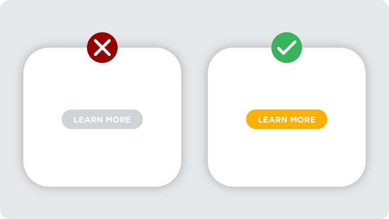
so, you have a customer browsing your site, attracted by a pair of drop earrings. They're ready to buy, but…where's the "Add to Cart" button? Is it hidden? Too small? Maybe they're unsure if you ship to their location or what the return policy is. Hesitation sets in, and before you know it, the sale is lost.
Why Clear Calls to Action are Crucial
Your website is not just a platform, consider it as a journey. Calls to action (CTAs) are the helpful buttons on your webpage that guide customers, telling them: "Go here!" "Click this!" Without those clear prompts, shoppers can get overwhelmed or unsure of what to do next. A confused shopper rarely clicks "buy."
The Impact
It's simple: if customers can't easily take the next step, you're losing out on sales. They might adore your jewellery, but even small bits of friction can ruin the whole process. It's like inviting someone to a party but not giving them the address!
The Solutions:
👉 Make it obvious: Your "Add to Cart," "Shop Now," and "Learn More" buttons need to stand out! Use contrasting colours, make them a good size, and don't be afraid of a little boldness. It should be obvious what a customer should click at every step.
👉 Placement: Your most important CTAs should be "above the fold" – meaning you see them without scrolling. Place those purchase buttons right beside your beautiful product images while the customer is excited!
👉 Sense of Urgency: Sometimes, a little nudge helps customers take action. "Limited time offer!" or "Only 3 left in stock!" create a sense of scarcity, encouraging people to buy before they miss out. (But only use this truthfully, of course!).
👉 Every Detail Matters: Do you have CTAs for other valuable actions? Think "Join Our Email List," "Create an Account," or "Read Reviews." Make these clear throughout the site to guide customers into a deeper relationship with your brand.
Real-Life Sparkling Examples
The Helpful Guide: A "Learn More" button near a custom design section encourages them to explore options on your website.
Building the Community: An eye-catching "Sign Up for Special Offers" CTA in the website footer turns visitors into subscribers.
Is your CTA actually bringing in Sales?
We can help you! Book a FREE Consultation call and we can boost your Jewelry Sales together.
Additional Problems to Consider
We've tackled some major website issues that can sink your sales, but here are a few more problems with your website that you would want to watch out for:
Lack of Trust Signals jewellery is a significant investment, and online shoppers want reassurance before they swipe that card! Make sure customer reviews are clearly displayed and your return policy is easy to find and generous. The goal is for customers to feel confident while buying from your brand.
A customer is wanting to buy an engagement ring but sees no reviews along with a vague return policy. They worry about quality and getting stuck with the wrong thing. They leave your site and keep searching.
Missing Personalization Think of online shopping as an exclusive experience – that's what today's customers expect! Features like "You Might Also Like" (based on their browsing history) or a virtual ring sizer add that tailored touch. It shows you're paying attention to their interests and want to help them make the perfect choice.
Someone loves a necklace but isn't sure what chain length to order. They search for a sizing guide or virtual tool to help visualize it, but find nothing. Frustrated, they abandon their cart.
Clutter and Distractions: jewellery needs space to shine! A website filled with clashing colours, too many banner ads, or annoying pop-ups will send shoppers running. Think clean, elegant design that puts the focus squarely on your gorgeous pieces. It's like choosing the perfect black velvet display case for your diamonds – let the jewellery be the star.
Bright flashing ads, unrelated pop-ups, and a chaotic layout frustrates a visitor who came for elegant simplicity. They leave your site feeling stressed and unlikely to return.
Conclusion
Fixing these website problems is like giving your jewellery a good cleaning – it makes everything sparkle like it should! Customers will find what they want, fall in love with your pieces, and click that "Buy" button with a smile😁.
But do you know how to make your website the best salesperson that can guarantee conversions?
Book a FREE Consultation with us to know more.
Don't believe we can help you?
Check out our customer success stories